Best Shopify Product Page Examples That Convert In 2025
Let’s be honest. In 2025, your Shopify product page is not just a place to list features. It is your salesperson. It is your brand storyteller. And more importantly, it is your deal-closer.
If you are a Shopify merchant, you already know how hard it is to grab attention and earn trust in seconds. The competition is fierce. Customers are smarter than ever. And every click counts.
So the real question is not what should go on a product page. The question is what actually works. What makes people click that Add to Cart button without hesitation?
In this blog, we will walk you through some of the best Shopify product page examples that are converting like crazy right now. These are real pages used by brands you probably recognize. You will see what they are doing differently and how you can apply the same ideas to your own store.
Let’s get started.
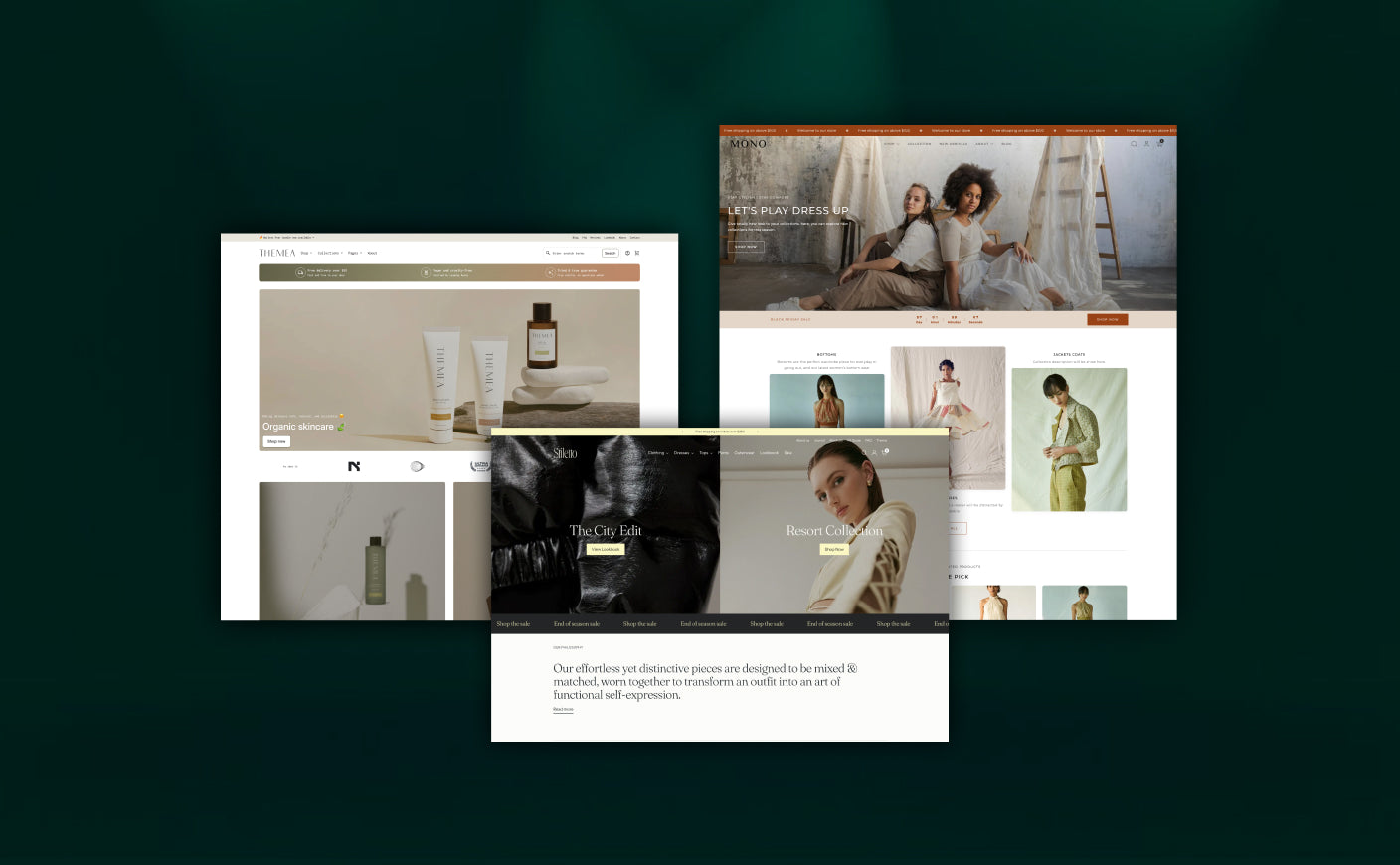
Top 10 Shopify Product Pages That Are Masterclasses in Conversion
We will go through some of the best product pages built on Shopify that are smart, strategic, and built to turn browsers into buyers.
Let’s break down what makes each one work.
#1 Master & Dynamic
 Minimal design, bold visuals, and effortless navigation: This is how you sell premium products without overwhelming the customer.
Master & Dynamic is a high-end audio brand based in New York and their product page is a perfect example of how luxury products should be presented online. It combines clean aesthetics with conversion-focused details that actually guide the shopper toward a confident purchase.
What works on this page:
-
Clear, high-quality imagery that builds trust - Every image, from close-up product shots to lifestyle use cases, serves a purpose. The layout highlights craftsmanship and material quality, which is crucial when you're selling premium products in the $200 and above range.
-
Anchored navigation that improves the user journey - A floating menu lets shoppers jump directly to key sections like Features, Tech Specs, In the Box, and Accessories. This keeps the experience smooth, especially for mobile users who don’t want to scroll endlessly.
-
Benefit-first messaging that feels personal - Instead of going into technical specs, the copy focuses on what matters to the shopper i.e., comfort, clarity, battery life, and build. It’s written in a way that feels helpful, not pushy.
-
Smart cross-sell placement at the bottom - Related accessories are shown right before the end of the page. It’s a subtle, well-timed upsell that appears when the shopper is already close to making a purchase.
Which Shopify theme gives a similar experience?
If you're a merchant looking to replicate this look, the Prestige theme is a great fit. It’s designed for premium brands, supports large imagery, elegant text sections, and comes with built-in support for recommended products and navigation-friendly layouts.
You can also consider Motion, which adds animated section transitions and embedded media, great for product demos or storytelling.
Also read: Is Shopify plus worth it for D2C brands? Here’s the truth
#2 FIGS
 FIGS is one of the biggest names in modern medical apparel, and their Shopify product page shows exactly how to blend utility with brand personality. It’s clean, fast, and designed to support busy shoppers who want details without distractions.
What works on this page?
-
Effortless product selection - Color and size options are displayed clearly, with helpful icons like “Core Color” and “Limited Edition” to guide quick decisions. The size chart is accessible without leaving the page.
-
Strong trust signals upfront - Ratings, reviews, and delivery timelines are placed right near the product title. This immediately reassures new customers who may be ordering scrubs for the first time.
-
Personalization and upsells - Shoppers can add custom embroidery directly from the page. Right below, there’s a “Wear it With” and “Complete the Look” section recommending matching tops or accessories.
Which Shopify theme gives a similar experience?
The Motion theme is a solid option here. It supports dynamic variant selectors, integrated reviews, and personalized add-ons. For a more minimalist version, Dawn can work well with a few custom blocks.
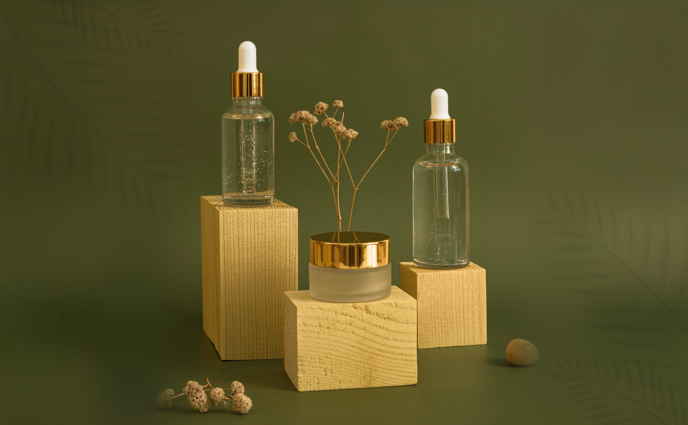
#3 Three Ships Beauty
 Three Ships Beauty is a natural skincare brand that focuses on transparency and simplicity, and their product page reflects that perfectly.
What works on this page:
-
Minimalist layout with focused imagery - Clean product shots are paired with close-ups of texture and application. The visuals feel honest and aligned with their all-natural brand message.
-
Before-and-after content builds real credibility - Testimonials with images and skin transformation stories are built right into the page. This gives social proof that’s far more powerful than star ratings alone.
-
Skincare education baked into the layout - Key ingredients, how to use the product, and skin-type recommendations are presented through collapsible sections that keep the page tidy.
Which Shopify theme gives a similar experience?
Try the Sense theme. It offers clean visuals, collapsible content sections, and space for before-and-after UGC. Add a reviews or testimonials app to complete the look.
#4 Magic Spoon
 Magic Spoon is a cereal brand that turned nostalgia into a modern DTC store. Their product page proves that fun design can still be ultra-strategic.
What works on this page:
-
Playful yet informative visual design and layout - The hero section features vibrant packaging imagery paired with bright icons. The color palette and illustration style instantly set the tone
-
Interactive build-your-own bundle selector - Shoppers can choose multiple flavors and create a custom box. The price updates in real time, making subscriptions or one-time purchases simple and transparent.
-
Subscribe and save prominently integrated - A subscription toggle appears right at the point of purchase. It offers 20% savings, free bowl set on first subscription, and flexible delivery options.
-
Trust messaging and reviewer social proof - “High Protein. Keto-Friendly. 80,000 + 5 star reviews.” appears near the top with endorsement logos. Customer ratings for specific packs show social validation instantly.
Also read: Popular clothing brands using Shopify in 2025
Which Shopify theme gives a similar experience?
The Motion theme is ideal. It handles bright iconography, interactive bundle selectors, and subscription integrations cleanly. For a more minimal version, Streamline with custom sections and a subscription app works well.
#5 Blume
 Blume is a Gen Z skincare brand that sells self-care with a side of real talk. Their Shopify product page is intentionally soft, minimal, and emotionally resonant, exactly what their audience wants.
What works on this page:
-
Transparent ingredient lists - The product page includes a clear list of key ingredients like niacinamide, centella, squalane, and licorice extract. Each one is explained in approachable copy i.e., what it does, and why it matters to the skin. That helps build confidence and brand trust.
-
Usage instructions and guidance - Each product includes quick notes on frequency of use and recommended skin type. This eliminates guesswork and helps buyers self-select.
-
Complementary product suggestions - Product pages suggest sets or bundles like acne treat and fade combinations. Those suggestions feel natural, supportive, and aligned with purchasing intent.
Which Shopify theme gives a similar experience?
For a clean, educational layout like this, Sense is an excellent match. It handles ingredient and usage sections neatly and allows product-specific metafields for rich copy. Pair it with a testimonial app and collapsible content blocks to mimic the Blume style.
If you plan to layer more visual storytelling or want smoother transitions within content sections, Motion would also work very well.
#6 Absolute Collagen
 Absolute Collagen is a UK-based beauty supplement brand that sells marine collagen in daily sachets. Their product pages are sleek, educational, and designed to answer customer doubts before they even ask.
What works on this page:
-
Science-backed messaging with a human touch - Instead of vague wellness claims, the page clearly outlines clinical trial results, ingredient sources, and measurable benefits. Yet, the tone remains customer-friendly, not overly scientific.
-
Trust-building elements front and center - The product description is supported by dermatologist endorsements, Trustpilot reviews, and customer transformations. This makes the product feel credible and safe, especially in the competitive health supplement space.
-
Clear subscription flow with visual prompts - Customers can toggle between a one-time purchase and a discounted subscription right on the product page. It’s visually intuitive, helping increase recurring revenue.
Also read: 5 Best Shopify B2B services every brand needs in 2025
Which Shopify theme gives a similar experience?
The Prestige theme is ideal for replicating Absolute Collagen’s clean and authoritative layout with sections for clinical results, testimonials, and flexible block order. For a stronger emphasis on content-driven storytelling and subscription messaging, Motion (with Recharge or Bold Subscriptions app) is also a great option.
#7 Loop Earplugs
 Loop is a lifestyle brand focused on hearing protection that combines utility, fashion, and clarity in their Shopify product page design. It's ideal for clients selling wellness, tech accessories, or sensory tools.
What works on this page:
-
Product comparison via adjustable noise-filter models - The Loop Switch 2 allows customers to quickly see and compare modes like Quiet, Experience and Engage, with SNR noise ratings (up to 26 dB) clearly listed. The packaging and product visuals reinforce each use case, from festival wear to quiet study sessions.
-
Clear product benefits and trust messaging from the top - Messaging like “Loved by 11 million customers” and “A crowd favorite” appears near the top. Models are supported by accolades and influencer references.
-
Return policy and warranty clarity - A 100‑day returns policy and two‑year warranty are highlighted in the page. This improves confidence and fit concerns for reusable earplugs.
Which Shopify theme gives a similar experience?
The Prestige theme is excellent for a clean, elegant layout that supports comparison tables, trust badges, and FAQs. Use metafields or accordion sections for detailed filtering information. If you want interactive product selectors or adjustable variations (like volume modes), Motion is a strong alternative, combined with variant media mapping.
#8 Pela Case
 Pela makes compostable phone cases, and their product page feels like an extension of their mission i.e., calm, educational, and gently persuasive. It’s not flashy, but it’s very intentional.
What works on this page:
Add-ons shown at just the right moment - When you select a phone case, you’re immediately offered complementary products like screen protectors or grips. It feels natural, not forced. A subtle upsell flow that works especially well for accessory brands.
A clear “why this costs more” explanation - Pela tackles the price objection head-on with a quick comparison block. It explains the cost of sustainable materials and the impact of plastic waste, making you feel like your purchase is doing good, not just costing more.
Sustainability woven throughout, not just a banner - Small icons, blurbs, and images reinforce the eco-message across the page.
Which Shopify theme gives a similar experience?
To build something similar, themes like Prestige or Motion are ideal. Both support storytelling sections, upsell blocks, and icon-rich layouts, without needing a heavy app stack.
#9 Glossier
 Glossier proves you don’t need a loud page to make a strong impact. Their product pages feel almost effortless, but they’re doing a lot of smart things behind the scenes.
What works on this page:
-
A layout that respects attention spans - You land on a sharp product photo followed by a quick one-liner about what the product does. Everything is spaced out well. It is easy to digest, especially for mobile shoppers who scroll fast.
-
Variant selection that feels natural - Shades and options are presented as simple swatches with clean labels. And when you click a shade, the main image updates instantly. This makes it feel like you are trying before buying.
-
Smart upsell suggestions without pressure - Just below the product description, you’ll spot a “You might also like” section showing related Glossier products. It does not scream - add more. Instead, it gently encourages bundling in a way that feels curated and personal.
-
Reviews that feel honest and helpful - No overproduced images or fake testimonials here. You get a clear sense of how people are using the product and what results they saw. It builds trust without overselling.
Which Shopify theme gives a similar experience?
If you are aiming for a similar feel, the Dawn or Crave theme is a good place to start. Both support clean layouts, swatch variants, product recommendations, and native review sections.
Also read: Best Shopify and Shopify plus agency in 2025
#10 Vitruvi
 Vitruvi is all about selling diffusers that look like sculpture and double as clean, elegant home scent systems. Their Shopify pages balance beautiful imagery and clear usability while guiding shoppers gently toward a confident purchase.
What works on this page:
-
Minimalist visuals that sell without shouting - Right at the top, you’re greeted with sleek product images including clean ceramic finishes, soft lighting, and real homes in the background. The layout isn’t trying to overload you. It simply lets the product breathe.
-
Straightforward details where it matters - They don’t make you dig for the specs. Coverage area, runtime, shut-off features, it’s all placed neatly a little below the visuals. The language is simple and jargon-free, which is key for a lifestyle product that blends beauty with function.
-
Brand story that doesn’t feel forced - Instead of shouting about sustainability, Vitruvi weaves in little nods to it throughout, from packaging to material sourcing. The tone resonates, especially with design-conscious shoppers in the wellness space.
Which Shopify theme gives a similar experience?
If you're aiming for this kind of clean, high-end vibe, Prestige is a great place to start. It gives you that same minimal layout with plenty of room for strong visuals and story-driven copy. If you want something a bit more dynamic with subtle animations, Motion is another solid pick, especially if you plan to bring your product storytelling to life.
Final Thoughts
At the end of the day, a great product page does more than just showcase a product. It builds trust, answers unspoken questions, and makes buying feel like the natural next step. The brands we covered are not just successful by chance. They have tested, refined, and built pages that focus on clarity and confidence.
If there is one thing to take away, it is this: Start simple, but always design with intention. The fewer the roadblocks, the quicker your customer reaches checkout.
If you want your product pages to work this hard for you, it helps to have the right partner. Find a Shopify Plus agency that actually understands how customers shop.